Identity
✦
Colour Theory
✦
User Centric Design
✦
Creativity
✦
Identity ✦ Colour Theory ✦ User Centric Design ✦ Creativity ✦
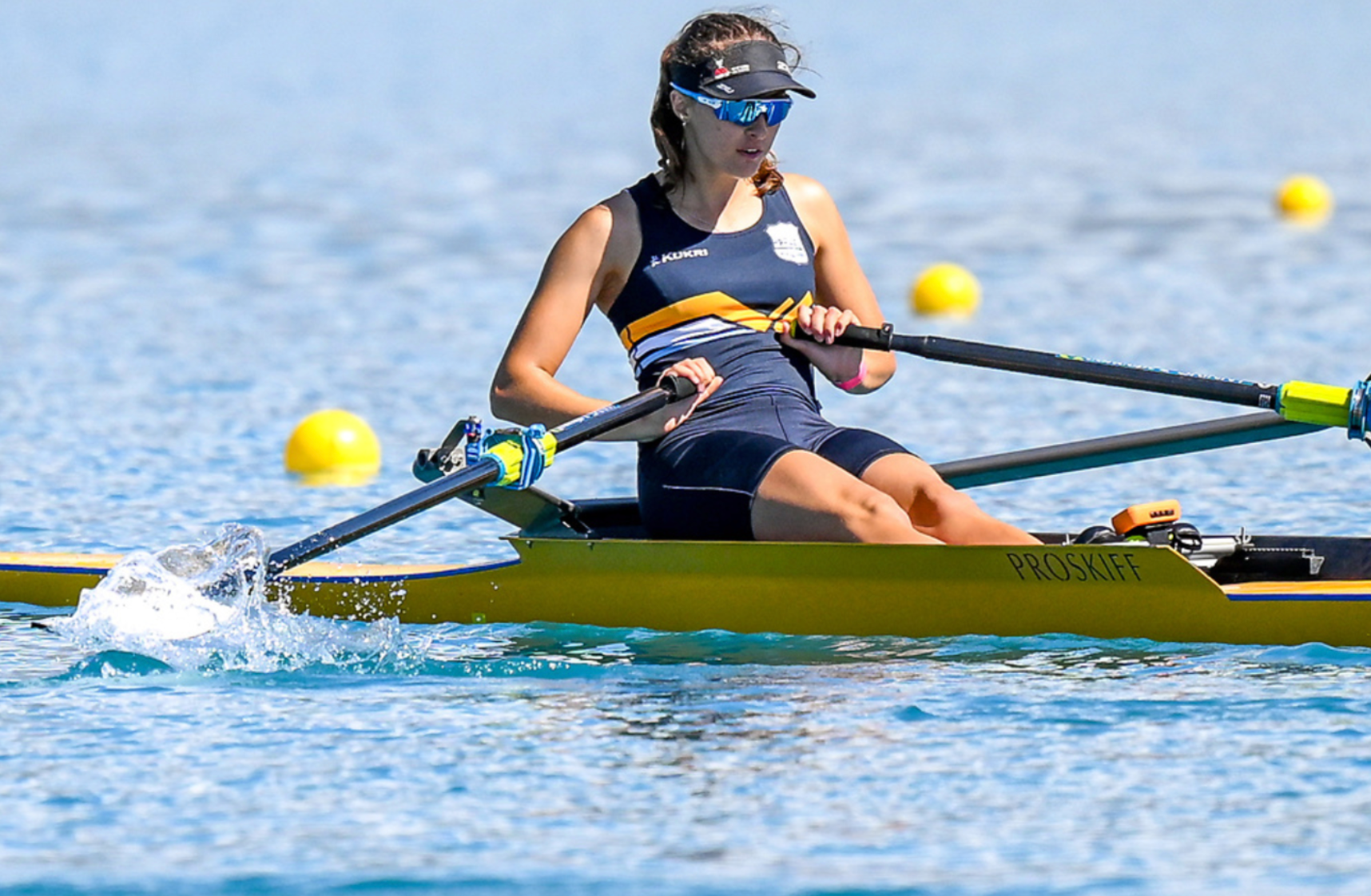
Whakatipu Rowing Club
Personal Project
The Whakatipu Rowing Club's new kit design reflects the local spirit and heritage of the club. Inspired by Queenstown's iconic mountain ranges surrounding Lake Hayes, the home of the Whakatipu Rowing Club, the logo subtly integrates a bold 'W' for Whakatipu, symbolising the club's identity and connection to
the region.
The stripes in the design represent movement, rhythm, and consistency, all qualities central to rowing. They also draw inspiration from the reflections on Lake Hayes and the layered contours of the surrounding mountains, bringing a sense of place.
This project was especially meaningful to me, as I grew up rowing for the club.


Primary Logo

Secondary Logo
The Kit